At news outlets tagging an article is not a trivial matter. Writers, editors don’t come up with tags; they choose from highly standardized, predefined lists. One such list is maintained by International Press Telecommunications Council (IPTC).
Media Topics is a constantly updated taxonomy of over 1,200 terms with a focus on categorising text.
Using controlled vocabularies rather than simple keywords allows for a consistent coding of news metadata across news providers and over the course of time.
Imagine you have the Media Topics available as terms of the iptc_media_topic taxonomy in WordPress.
The question is: do you need a custom term selector for it?
The default term selectors
By default, in the Block Editor, there are two types of selectors for taxonomies: the HierarchicalTermSelector and the FlatTermSelector.

Here are a few reasons why these won’t cut it for the IPTC Media Topics selector.
Conveniently the selectors offer the ability to create terms inline without needing to go to a different admin screen. In our case, we should prevent introducing custom Media Topics (terms) to protect the integrity of the “controlled vocabulary”. Having the option to create new ones easily is asking for trouble.
From a technical perspective, there’s a good chance that rendering over 1200 items with the Hierarchical Term Selector would start hampering the performance of the UI.
Non-optimized components for large datasets can quickly degrade the experience of the Block Editor. We should strongly consider list virtualization for a custom implementation that renders just items visible to the user rather than the entire list at once.
Design-wise, seeing hundreds and hundreds of nested checkboxes is overwhelming and noisy. It gets the job done, but there are better choices. One alternative that, in certain circumstances, comes up as superior is the chips.
The custom selector
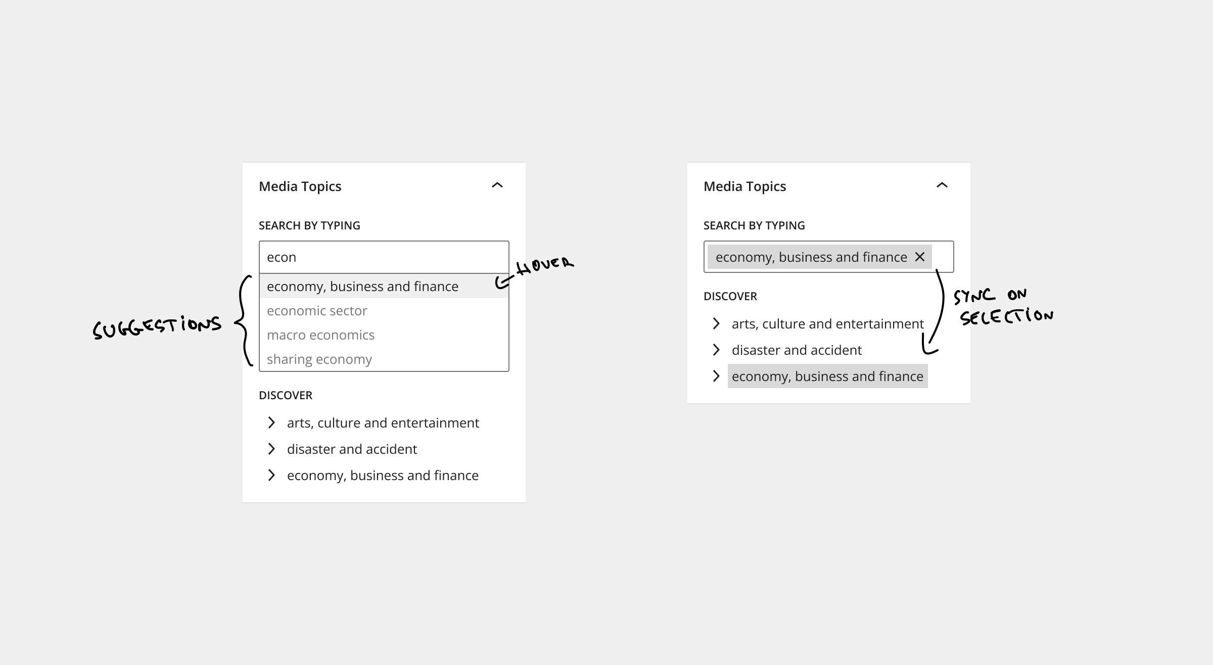
Editors either know which Media Topics they want to use or they want to pick one that fits. This means there are two different modes of usage.
UI elements typically are optimized for one usage, so the solution to this puzzle is a combined, hybrid selector.
A few alternatives were considered, like the “multiple selection dropdown” or some kind of a “drill-down menu”, but in the end, they were ruled out because they did not provide a good overview, were too cluttered, etc.
Search by typing
To keep the consistency of the UI, we can use the component called FormTokenField from WordPress. It’s the same component used for the FlatTermSelector, but a more low-level component.

This will be the primary selector that is used for searching, removing the items, and presenting the choices.
Compared to FlatTermSelector this does not have the option to add new terms freely; only the possibility of selecting from the suggestion exists.
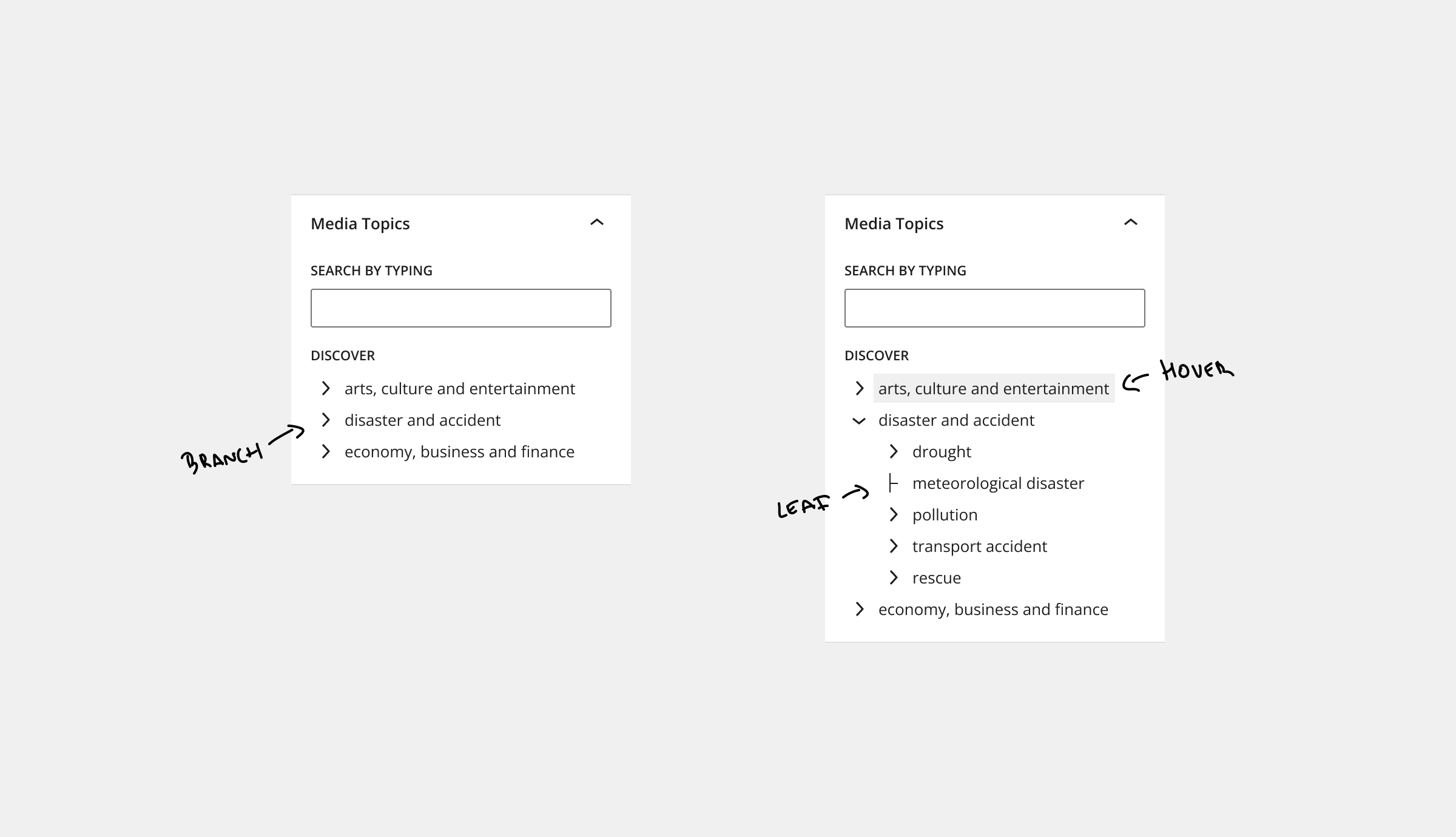
Discover
Having a tree-type selector is a good fit. It reflects the Media Topics’ hierarchical nature, but it also allows a better browsing experience than the checkboxes list. It’s a more compact and less busy option.

Not surprisingly, the IPTC Media Topic NewsCodes are also presented with a tree-type selector.
For this, there’s no WordPress component we could use. The closest is the TreeGrid, but that is for tabular data and provides only little out-of-the-box functionality for our needs. Creating a tree component might seem deceivingly simple, but there are many gotchas. Using a 3rd-party tree component, like rc-tree, could save a lot of time.
We should integrate new components, custom or 3rd-party, as seamlessly as possible. Details such as using WordPress library icons and consistent font sizes and colors make a big difference.
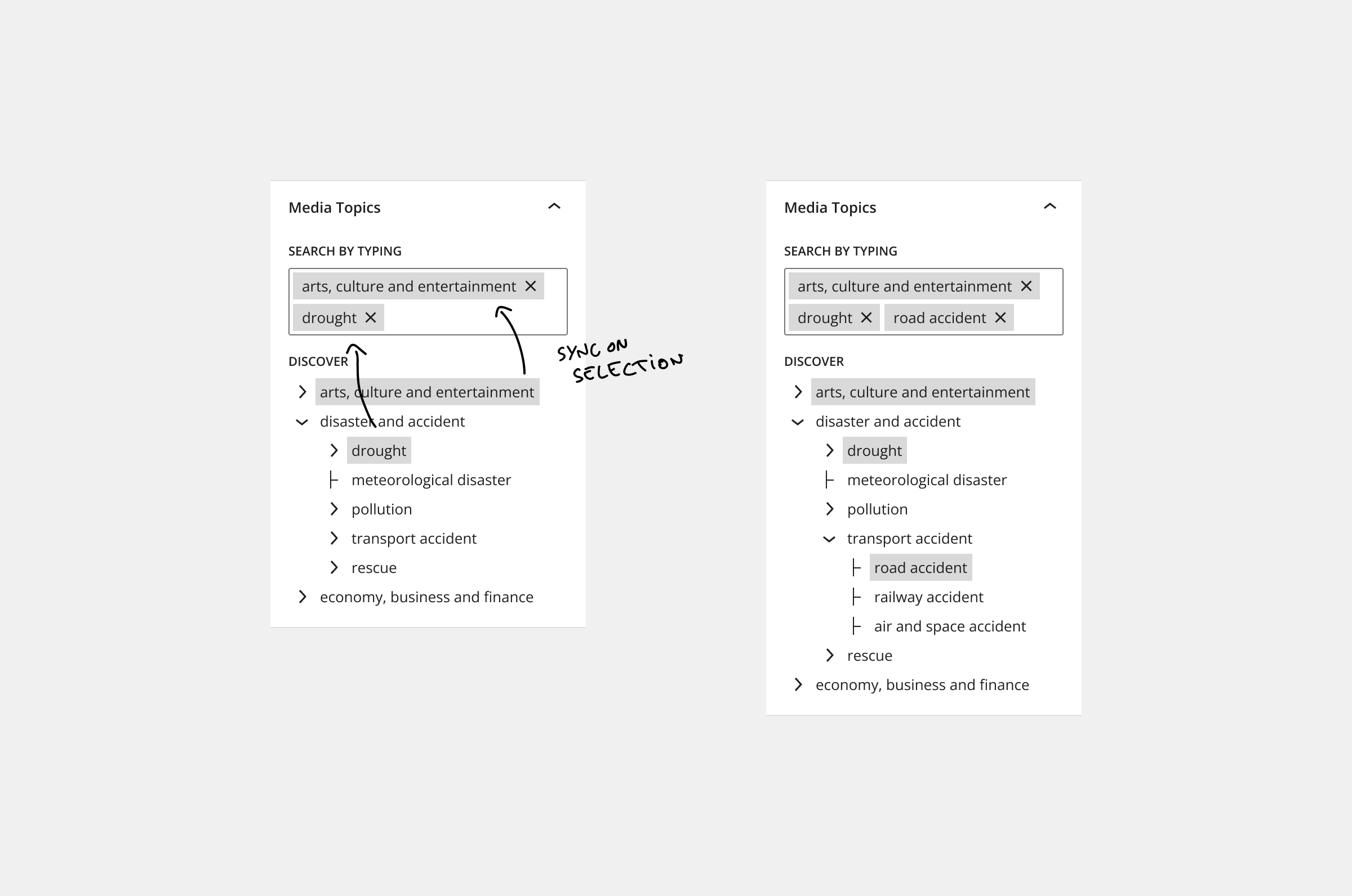
State synchronisation
Even though there will technically be two separate React components, sharing a common state is possible and a common pattern.

By making sure that selections are reflected in both selectors, they will look seamless and a cohesive unit.
Working on UI elements for the Block Editor is an interesting cross-section between development and hobby-UX/UI design. Some prefer to work only on the implementation, but I also like to get hands-on with this part.
Thinking through, creating the mockup, and pitching the solution for a client project was rewarding, not just because it was accepted.
This is, of course, a summary of the more crucial angles presented logically. The entire process was more hectic, sometimes even intuitional, building on prior knowledge. These highly polished mockups were created for this article; something low-fidelity was perfect enough to get the ideas across.
Special thanks to G.V., a proper designer, for suggesting adding the “Discover” title before the tree selector. A minor detail with an overall impact; clarifies both the intention of the element and creates better visual separation.